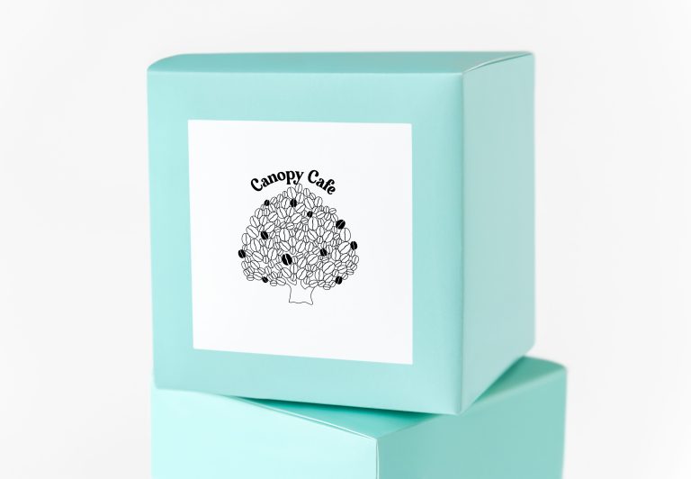
The Canopy Cafe logo features a striking black and white rendition of a canopy tree, exuding a sense of elegance, sophistication, and simplicity. This minimalist design captures the essence of nature and reflects the cafe’s commitment to providing a serene and inviting atmosphere.
This black and white canopy tree logo for Canopy Cafe portrays a refined and contemporary image. It communicates the cafe’s commitment to creating an inviting and natural space where customers can relax and enjoy culinary delights. The simplicity and elegance of the design make it versatile, allowing for easy integration across various branding materials, signage, menus, and digital platforms.
The use of black and white in the logo adds a timeless and versatile aesthetic. The contrast between the two colors creates a visually striking image, allowing the logo to stand out across various applications. The black and white palette also represents the duality of nature, with black symbolizing strength, elegance, and sophistication, while white conveys purity, simplicity, and tranquility.
The typography accompanying the logo is chosen to complement the minimalistic design. A clean and modern font is selected, with the cafe’s name placed alongside or beneath the canopy tree. The font adds a touch of sophistication and ensures legibility while maintaining a harmonious balance with the logo’s overall style.
The logo showcases a stylized representation of a tall tree with an expansive canopy. The tree is depicted in a silhouette form, with clean lines and minimal details, creating a distinctive and memorable visual. The canopy branches out gracefully, creating a sense of shelter and tranquility.